Practical Statistics & Visualization With Python & Plotly

One day last week, I was googling “statistics with Python”, the results were somewhat unfruitful. Most literature, tutorials and articles focus on statistics with R, because R is a language dedicated to statistics and has more statistical analysis features than Python.
In two excellent statistics books, “Practical Statistics for Data Scientists” and “An Introduction to Statistical Learning”, the statistical concepts were all implemented in R.
Data science is a fusion of multiple disciplines, including statistics, computer science, information technology, and domain-specific fields. And we use powerful, open-source Python tools daily to manipulate, analyze, and visualize datasets.
And I would certainly recommend anyone interested in becoming a Data Scientist or Machine Learning Engineer to develop a deep understanding and practice constantly on statistical learning theories.
This prompts me to write a post for the subject. And I will use one dataset to review as many statistics concepts as I can and lets get started!
The Data
The data is the house prices data set that can be found here.
import numpy as np
import pandas as pd
import matplotlib.pyplot as plt
import seaborn as sns
from plotly.offline import init_notebook_mode, iplot
import plotly.figure_factory as ff
import cufflinks
cufflinks.go_offline()
cufflinks.set_config_file(world_readable=True, theme='pearl')
import plotly.graph_objs as go
import plotly.plotly as py
import plotly
from plotly import tools
plotly.tools.set_credentials_file(username='XXX', api_key='XXX')
init_notebook_mode(connected=True)
pd.set_option('display.max_columns', 100)
df = pd.read_csv('house_train.csv')
df.drop('Id', axis=1, inplace=True)
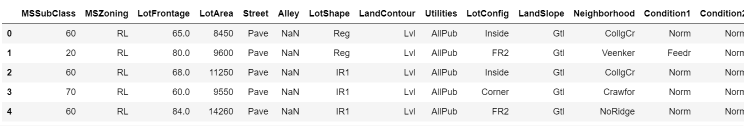
df.head()
Univariate Data Analysis
Describing Data
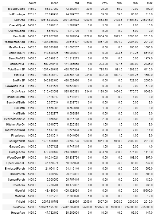
Statistical summary for numeric data include things like the mean, min, and max of the data, can be useful to get a feel for how large some of the variables are and what variables may be the most important.
df.describe().T
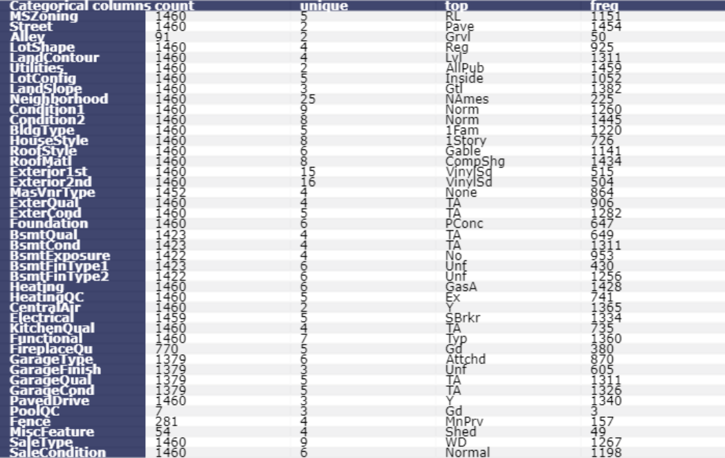
Statistical summary for categorical or string variables will show “count”, “unique”, “top”, and “freq”.
table_cat = ff.create_table(df.describe(include=['O']).T, index=True, index_title='Categorical columns')
iplot(table_cat)
Histogram
Plot a histogram of SalePrice of all the houses in the data.
df['SalePrice'].iplot(
    kind='hist',
    bins=100,
    xTitle='price',
    linecolor='black',
    yTitle='count',
    title='Histogram of Sale Price')
Boxplot
Plot a boxplot of SalePrice of all the houses in the data. Boxplots do not show the shape of the distribution, but they can give us a better idea about the center and spread of the distribution as well as any potential outliers that may exist. Boxplots and Histograms often complement each other and help us understand more about the data.
df['SalePrice'].iplot(kind='box', title='Box plot of SalePrice')
Plotting by groups, we can see how a variable changes in response to another. For example, if there is a difference between house SalePrice with or with no central air conditioning. Or if house SalePrice varies according to the size of the garage, and so on.
Boxplot and histogram of house sale price grouped by with or with no air conditioning
trace0 = go.Box(
    y=df.loc[df['CentralAir'] == 'Y']['SalePrice'],
    name = 'With air conditioning',
    marker = dict(
        color = 'rgb(214, 12, 140)',
    )
)
trace1 = go.Box(
    y=df.loc[df['CentralAir'] == 'N']['SalePrice'],
    name = 'no air conditioning',
    marker = dict(
        color = 'rgb(0, 128, 128)',
    )
)
data = [trace0, trace1]
layout = go.Layout(
    title = "Boxplot of Sale Price by air conditioning"
)

fig = go.Figure(data=data,layout=layout)
py.iplot(fig)
boxplot_aircon.py
trace0 = go.Histogram(
    x=df.loc[df['CentralAir'] == 'Y']['SalePrice'], name='With Central air conditioning',
    opacity=0.75
)
trace1 = go.Histogram(
    x=df.loc[df['CentralAir'] == 'N']['SalePrice'], name='No Central air conditioning',
    opacity=0.75
)

data = [trace0, trace1]
layout = go.Layout(barmode='overlay', title='Histogram of House Sale Price for both with and with no Central air conditioning')
fig = go.Figure(data=data, layout=layout)

py.iplot(fig)
histogram_aircon.py
df.groupby('CentralAir')['SalePrice'].describe()
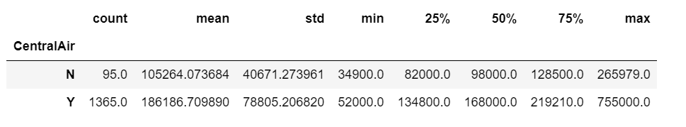
It is obviously that the mean and median sale price for houses with no air conditioning are much lower than the houses with air conditioning.
Boxplot and histogram of house sale price grouped by garage size
trace0 = go.Box(
    y=df.loc[df['GarageCars'] == 0]['SalePrice'],
    name = 'no garage',
    marker = dict(
        color = 'rgb(214, 12, 140)',
    )
)
trace1 = go.Box(
    y=df.loc[df['GarageCars'] == 1]['SalePrice'],
    name = '1-car garage',
    marker = dict(
        color = 'rgb(0, 128, 128)',
    )
)
trace2 = go.Box(
    y=df.loc[df['GarageCars'] == 2]['SalePrice'],
    name = '2-cars garage',
    marker = dict(
        color = 'rgb(12, 102, 14)',
    )
)
trace3 = go.Box(
    y=df.loc[df['GarageCars'] == 3]['SalePrice'],
    name = '3-cars garage',
    marker = dict(
        color = 'rgb(10, 0, 100)',
    )
)
trace4 = go.Box(
    y=df.loc[df['GarageCars'] == 4]['SalePrice'],
    name = '4-cars garage',
    marker = dict(
        color = 'rgb(100, 0, 10)',
    )
)
data = [trace0, trace1, trace2, trace3, trace4]
layout = go.Layout(
    title = "Boxplot of Sale Price by garage size"
)

fig = go.Figure(data=data,layout=layout)
py.iplot(fig)
boxplot_garage.py
The larger the garage, the higher house median price, this works until we reach 3-cars garage. Apparently, the houses with 3-cars garages have the highest median price, even higher than the houses with 4-cars garage.
Histogram of house sale price with no garage
df.loc[df['GarageCars'] == 0]['SalePrice'].iplot(
    kind='hist',
    bins=50,
    xTitle='price',
    linecolor='black',
    yTitle='count',
    title='Histogram of Sale Price of houses with no garage')
Histogram of house sale price with 1-car garage
df.loc[df['GarageCars'] == 1]['SalePrice'].iplot(
    kind='hist',
    bins=50,
    xTitle='price',
    linecolor='black',
    yTitle='count',
    title='Histogram of Sale Price of houses with 1-car garage')
Histogram of house sale price with 2-car garage
df.loc[df['GarageCars'] == 2]['SalePrice'].iplot(
    kind='hist',
    bins=100,
    xTitle='price',
    linecolor='black',
    yTitle='count',
    title='Histogram of Sale Price of houses with 2-car garage')
Histogram of house sale price with 3-car garage
df.loc[df['GarageCars'] == 3]['SalePrice'].iplot(
    kind='hist',
    bins=50,
    xTitle='price',
    linecolor='black',
    yTitle='count',
    title='Histogram of Sale Price of houses with 3-car garage')
Histogram of house sale price with 4-car garage
df.loc[df['GarageCars'] == 4]['SalePrice'].iplot(
    kind='hist',
    bins=10,
    xTitle='price',
    linecolor='black',
    yTitle='count',
    title='Histogram of Sale Price of houses with 4-car garage')
Frequency Table
Frequency tells us how often something happened. Frequency tables give us a snapshot of the data to allow us to find patterns.
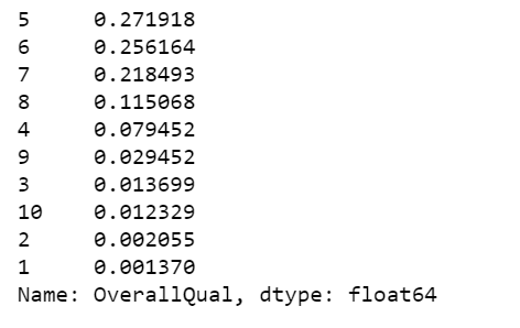
Overall quality frequency table
x = df.OverallQual.value_counts()
x/x.sum()
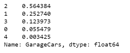
Garage size frequency table
x = df.GarageCars.value_counts()
x/x.sum()
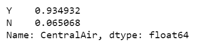
Central air conditioning frequency table
x = df.CentralAir.value_counts()
x/x.sum()
Numerical Summaries
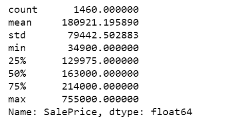
A quick way to get a set of numerical summaries for a quantitative variable is to use the describe method.
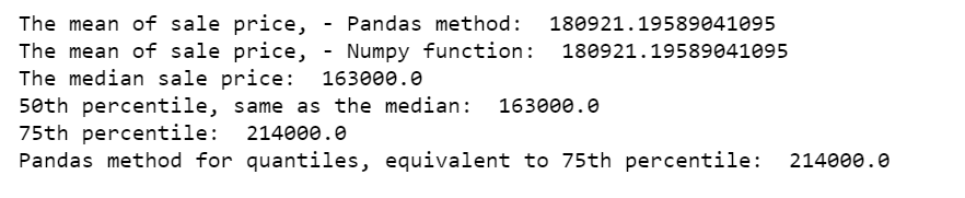
df.SalePrice.describe()
We can also calculate individual summary statistics of SalePrice.
print("The mean of sale price, - Pandas method: ", df.SalePrice.mean())
print("The mean of sale price, - Numpy function: ", np.mean(df.SalePrice))
print("The median sale price: ", df.SalePrice.median())
print("50th percentile, same as the median: ", np.percentile(df.SalePrice, 50))
print("75th percentile: ", np.percentile(df.SalePrice, 75))
print("Pandas method for quantiles, equivalent to 75th percentile: ", df.SalePrice.quantile(0.75))
Calculate the proportion of the houses with sale price between 25th percentile (129975) and 75th percentile (214000).
print('The proportion of the houses with prices between 25th percentile and 75th percentile: ', np.mean((df.SalePrice >= 129975) & (df.SalePrice <= 214000)))

Calculate the proportion of the houses with total square feet of basement area between 25th percentile (795.75) and 75th percentile (1298.25).
print('The proportion of house with total square feet of basement area between 25th percentile and 75th percentile: ', np.mean((df.TotalBsmtSF >= 795.75) & (df.TotalBsmtSF <= 1298.25)))

Lastly, we calculate the proportion of the houses based on either conditions. Since some houses are under both criteria, the proportion below is less than the sum of the two proportions calculated above.
a = (df.SalePrice >= 129975) & (df.SalePrice <= 214000)
b = (df.TotalBsmtSF >= 795.75) & (df.TotalBsmtSF <= 1298.25)
print(np.mean(a | b))
Calculate sale price IQR for houses with no air conditioning.
q75, q25 = np.percentile(df.loc[df['CentralAir']=='N']['SalePrice'], [75,25])
iqr = q75 - q25
print('Sale price IQR for houses with no air conditioning: ', iqr)

Calculate sale price IQR for houses with air conditioning.
q75, q25 = np.percentile(df.loc[df['CentralAir']=='Y']['SalePrice'], [75,25])
iqr = q75 - q25
print('Sale price IQR for houses with air conditioning: ', iqr)

Stratification
Another way to get more information out of a dataset is to divide it into smaller, more uniform subsets, and analyze each of these “strata” on its own. We will create a new HouseAge column, then partition the data into HouseAge strata, and construct side-by-side boxplots of the sale price within each stratum.
df['HouseAge'] = 2019 - df['YearBuilt']
df["AgeGrp"] = pd.cut(df.HouseAge, [9, 20, 40, 60, 80, 100, 147]) # Create age strata based on these cut points
plt.figure(figsize=(12, 5))
sns.boxplot(x="AgeGrp", y="SalePrice", data=df);
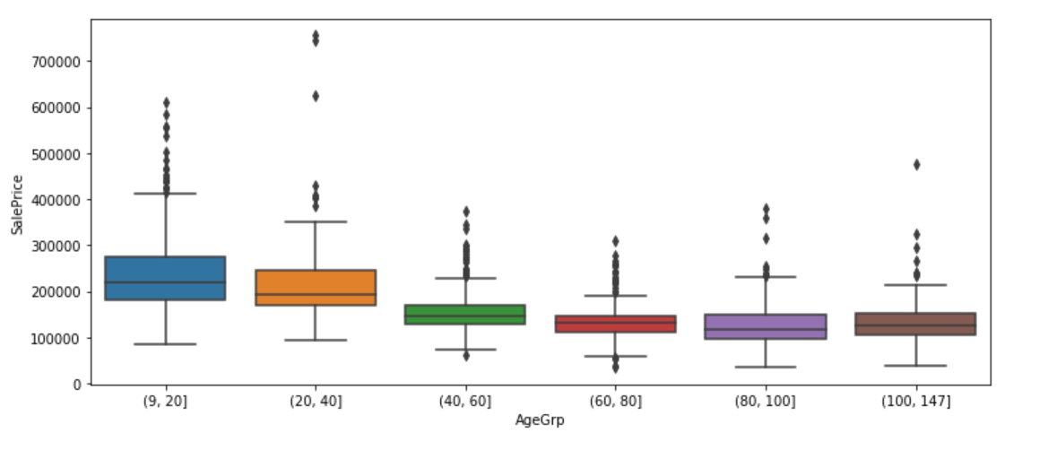
The older the house, the lower the median price, that is, house price tends to decrease with age, until it reaches 100 years old. The median price of over 100 year old houses is higher than the median price of houses age between 80 and 100 years.
plt.figure(figsize=(12, 5))
sns.boxplot(x="AgeGrp", y="SalePrice", hue="CentralAir", data=df)
plt.show();
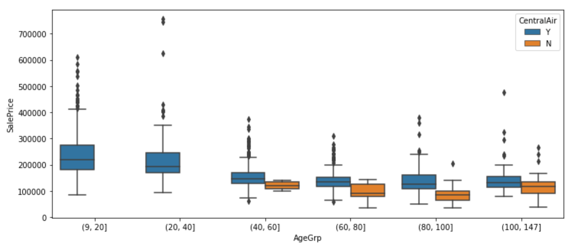
We have learned earlier that house price tends to differ between with and with no air conditioning. From above graph, we also find out that recent houses (9–40 years old) are all equipped with air conditioning.
plt.figure(figsize=(12, 5))
sns.boxplot(x="CentralAir", y="SalePrice", hue="AgeGrp", data=df)
plt.show();
We now group first by air conditioning, and then within air conditioning group by age bands. Each approach highlights a different aspect of the data.
We can also stratify jointly by House age and air conditioning to explore how building type varies by both of these factors simultaneously.
df1 = df.groupby(["AgeGrp", "CentralAir"])["BldgType"]
df1 = df1.value_counts()
df1 = df1.unstack()
df1 = df1.apply(lambda x: x/x.sum(), axis=1)
print(df1.to_string(float_format="%.3f"))
For all house age groups, vast majority type of dwelling in the data is 1Fam. The older the house, the more likely to have no air conditioning. However, for a 1Fam house over 100 years old, it is a little more likely to have air conditioning than not. There were neither very new nor very old duplex house types. For a 40–60 year old duplex house, it is more likely to have no air conditioning.
Multivariate Analysis
Scatter plot
A scatter plot is a very common and easily-understood visualization of quantitative bivariate data. Below we make a scatter plot of Sale Price against Above ground living area square feet. it is apparently a linear relationship.
df.iplot(
    x='GrLivArea',
    y='SalePrice',
    xTitle='Above ground living area square feet',
    yTitle='Sale price',
    mode='markers',
    title='Sale Price vs Above ground living area square feet')
2D Density Joint plot
The following two plot margins show the densities for the Sale Price and Above ground living area separately, while the plot in the center shows their density jointly.
trace1 = go.Scatter(
    x=df['GrLivArea'], y=df['SalePrice'], mode='markers', name='points',
    marker=dict(color='rgb(102,0,0)', size=2, opacity=0.4)
)
trace2 = go.Histogram2dContour(
    x=df['GrLivArea'], y=df['SalePrice'], name='density', ncontours=20,
    colorscale='Hot', reversescale=True, showscale=False
)
trace3 = go.Histogram(
    x=df['GrLivArea'], name='Ground Living area density',
    marker=dict(color='rgb(102,0,0)'),
    yaxis='y2'
)
trace4 = go.Histogram(
    y=df['SalePrice'], name='Sale Price density', marker=dict(color='rgb(102,0,0)'),
    xaxis='x2'
)
data = [trace1, trace2, trace3, trace4]

layout = go.Layout(
    showlegend=False,
    autosize=False,
    width=600,
    height=550,
    xaxis=dict(
        domain=[0, 0.85],
        showgrid=False,
        zeroline=False
    ),
    yaxis=dict(
        domain=[0, 0.85],
        showgrid=False,
        zeroline=False
    ),
    margin=dict(
        t=50
    ),
    hovermode='closest',
    bargap=0,
    xaxis2=dict(
        domain=[0.85, 1],
        showgrid=False,
        zeroline=False
    ),
    yaxis2=dict(
        domain=[0.85, 1],
        showgrid=False,
        zeroline=False
    )
)

fig = go.Figure(data=data, layout=layout)
py.iplot(fig)
price_GrLivArea.py
Heterogeneity and stratification
We continue exploring the relationship between SalePrice and GrLivArea, stratifying by BldgType.
trace0 = go.Scatter(x=df.loc[df['BldgType'] == '1Fam']['GrLivArea'], y=df.loc[df['BldgType'] == '1Fam']['SalePrice'], mode='markers', name='1Fam')
trace1 = go.Scatter(x=df.loc[df['BldgType'] == 'TwnhsE']['GrLivArea'], y=df.loc[df['BldgType'] == 'TwnhsE']['SalePrice'], mode='markers', name='TwnhsE')
trace2 = go.Scatter(x=df.loc[df['BldgType'] == 'Duplex']['GrLivArea'], y=df.loc[df['BldgType'] == 'Duplex']['SalePrice'], mode='markers', name='Duplex')
trace3 = go.Scatter(x=df.loc[df['BldgType'] == 'Twnhs']['GrLivArea'], y=df.loc[df['BldgType'] == 'Twnhs']['SalePrice'], mode='markers', name='Twnhs')
trace4 = go.Scatter(x=df.loc[df['BldgType'] == '2fmCon']['GrLivArea'], y=df.loc[df['BldgType'] == '2fmCon']['SalePrice'], mode='markers', name='2fmCon')

fig = tools.make_subplots(rows=2, cols=3)

fig.append_trace(trace0, 1, 1)
fig.append_trace(trace1, 1, 2)
fig.append_trace(trace2, 1, 3)
fig.append_trace(trace3, 2, 1)
fig.append_trace(trace4, 2, 2)

fig['layout'].update(height=400, width=800, title='Sale price Vs. Above ground living area square feet' +
                                                  ' by building type')
py.iplot(fig)
**stratify.py **

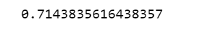
In almost all the building types, SalePrice and GrLivArea shows a positive linear relationship. In the results below, we see that the correlation between SalepPrice and GrLivArea in 1Fam building type is the highest at 0.74, while in Duplex building type the correlation is the lowest at 0.49.
print(df.loc[df.BldgType=="1Fam", ["GrLivArea", "SalePrice"]].corr())
print(df.loc[df.BldgType=="TwnhsE", ["GrLivArea", "SalePrice"]].corr())
print(df.loc[df.BldgType=='Duplex', ["GrLivArea", "SalePrice"]].corr())
print(df.loc[df.BldgType=="Twnhs", ["GrLivArea", "SalePrice"]].corr())
print(df.loc[df.BldgType=="2fmCon", ["GrLivArea", "SalePrice"]].corr())
Categorical bivariate analysis
We create a contingency table, counting the number of houses in each cell defined by a combination of building type and the general zoning classification.
x = pd.crosstab(df.MSZoning, df.BldgType)
x
Below we normalize within rows. This gives us the proportion of houses in each zoning classification that fall into each building type variable.
x.apply(lambda z: z/z.sum(), axis=1)
We can also normalize within the columns. This gives us the proportion of houses within each building type that fall into each zoning classification.
x.apply(lambda z: z/z.sum(), axis=0)
One step further, we will look at the proportion of houses in each zoning class, for each combination of the air conditioning and building type variables.
df.groupby(["CentralAir", "BldgType", "MSZoning"]).size().unstack().fillna(0).apply(lambda x: x/x.sum(), axis=1)
The highest proportion of houses in the data are the ones with zoning RL, with air conditioning and 1Fam building type. With no air conditioning, the highest proportion of houses are the ones in zoning RL and Duplex building type.
Mixed categorical and quantitative data
To get fancier, we are going to plot a violin plot to show the distribution of SalePrice for houses that are in each building type category.
data = []
for i in range(0,len(pd.unique(df['BldgType']))):
    trace = {
            "type": 'violin',
            "x": df['BldgType'][df['BldgType'] == pd.unique(df['BldgType'])[i]],
            "y": df['SalePrice'][df['BldgType'] == pd.unique(df['BldgType'])[i]],
            "name": pd.unique(df['BldgType'])[i],
            "box": {
                "visible": True
            },
            "meanline": {
                "visible": True
            }
        }
    data.append(trace)


fig = {
    "data": data,
    "layout" : {
        "title": "",
        "yaxis": {
            "zeroline": False,
        }
    }
}


py.iplot(fig)
price_violin_plot.py
We can see that the SalesPrice distribution of 1Fam building type are slightly right-skewed, and for the other building types, the SalePrice distributions are nearly normal.✅ Further reading:
☞ Learn Python Through Exercises
☞ The Python Bible™ | Everything You Need to Program in Python
☞ The Ultimate Python Programming Tutorial
☞ Python for Data Analysis and Visualization - 32 HD Hours !
\
Suggest:
☞ Machine Learning Zero to Hero - Learn Machine Learning from scratch
☞ Learn Python in 12 Hours | Python Tutorial For Beginners
☞ Complete Python Tutorial for Beginners (2019)
☞ What is Python and Why You Must Learn It in [2019]
☞ Python Machine Learning Tutorial (Data Science)
☞ Python Programming Tutorial | Full Python Course for Beginners 2019