The Next Level of Data Visualization in Python

The sunk-cost fallacy is one of many harmful cognitive biases to which humans fall prey. It refers to our tendency to continue to devote time and resources to a lost cause because we have already spent — sunk — so much time in the pursuit. The sunk-cost fallacy applies to staying in bad jobs longer than we should, slaving away at a project even when it’s clear it won’t work, and yes, continuing to use a tedious, outdated plotting library — matplotlib — when more efficient, interactive, and better-looking alternatives exist.
Over the past few months, I’ve realized the only reason I use matplotlib is the hundreds of hours I’ve sunk into learning the convoluted syntax. This complication leads to hours of frustration on StackOverflow figuring out how to format dates or add a second y-axis. Fortunately, this is a great time for Python plotting, and after exploring the options, a clear winner — in terms of ease-of-use, documentation, and functionality — is the plotly Python library. In this article, we’ll dive right into plotly, learning how to make better plots in less time — often with one line of code.
All of the code for this article is available on GitHub. The charts are all interactive and can be viewed on NBViewer here.
Plotly Brief Overview
The [plotly](https://plot.ly/python/) Python package is an open-source library built on [plotly.js](https://plot.ly/javascript/) which in turn is built on [d3.js](https://d3js.org/). We’ll be using a wrapper on plotly called [cufflinks](https://github.com/santosjorge/cufflinks) designed to work with Pandas dataframes. So, our entire stack is cufflinks > plotly > plotly.js > d3.js which means we get the efficiency of coding in Python with the incredible interactive graphics capabilities of d3.
(Plotly itself is a graphics company with several products and open-source tools. The Python library is free to use, and we can make unlimited charts in offline mode plus up to 25 charts in online mode to share with the world.)
All the work in this article was done in a Jupyter Notebook with plotly + cufflinks running in offline mode. After installing plotly and cufflinks with pip install cufflinks plotly import the following to run in Jupyter:
# Standard plotly imports
import plotly.plotly as py
import plotly.graph_objs as go
from plotly.offline import iplot, init_notebook_mode
# Using plotly + cufflinks in offline mode
import cufflinks
cufflinks.go_offline(connected=True)
init_notebook_mode(connected=True)
Single Variable Distributions: Histograms and Boxplots
Single variable — univariate — plots are a standard way to start an analysis and the histogram is a go-to plot (although it has some issues) for graphing a distribution. Here, using my Medium article statistics (you can see how to get your own stats here or use mine here) let’s make an interactive histogram of the number of claps for articles ( df is a standard Pandas dataframe):
df['claps'].iplot(kind='hist', xTitle='claps',
                  yTitle='count', title='Claps Distribution')
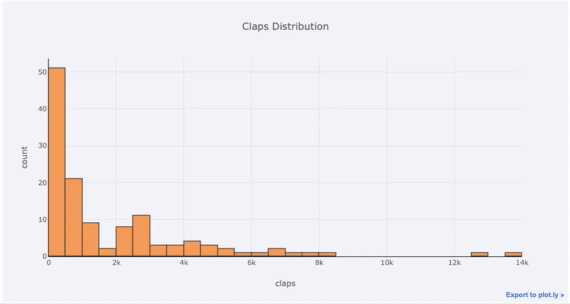
For those used to matplotlib, all we have to do is add one more letter ( iplot instead of plot) and we get a much better-looking and interactive chart! We can click on the data to get more details, zoom into sections of the plot, and as we’ll see later, select different categories to highlight.
If we want to plot overlaid histograms, that’s just as simple:
df[['time_started', 'time_published']].iplot(
    kind='hist',
    histnorm='percent',
    barmode='overlay',
    xTitle='Time of Day',
    yTitle='(%) of Articles',
    title='Time Started and Time Published')

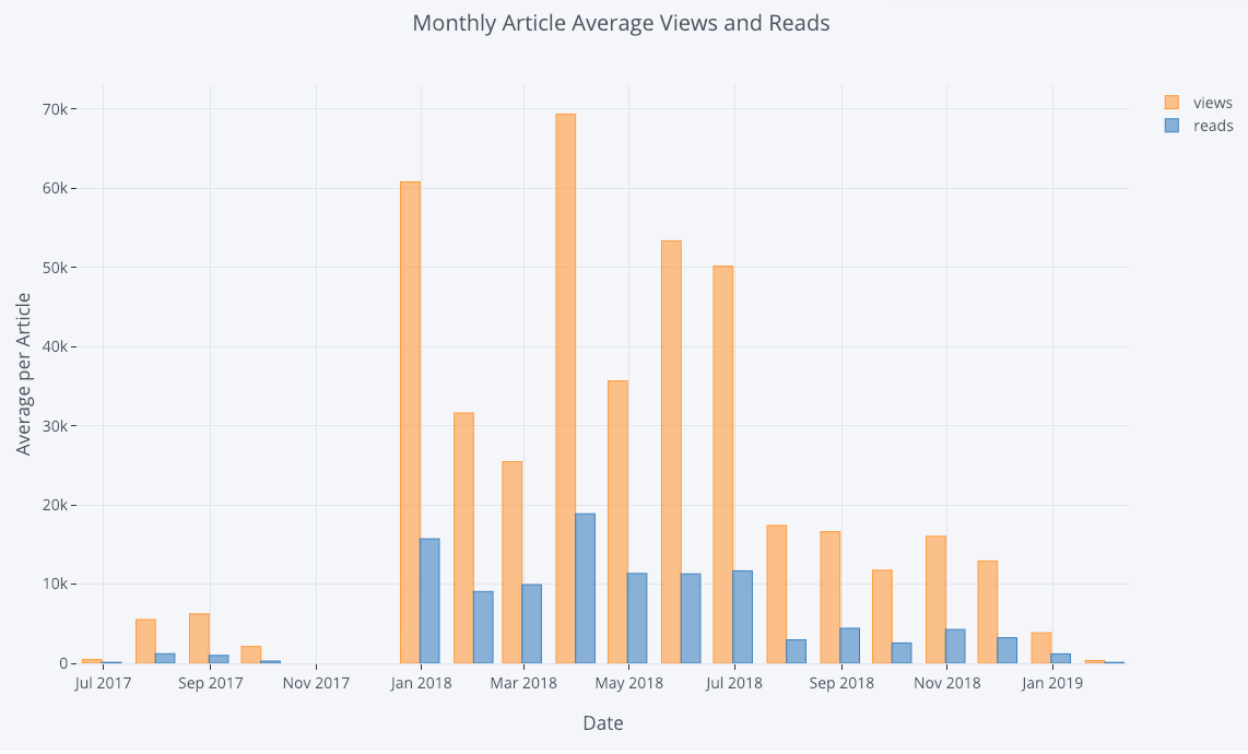
With a little bit of pandas manipulation, we can do a barplot:
# Resample to monthly frequency and plot
df2 = df[['view','reads','published_date']].\
         set_index('published_date').\
         resample('M').mean()
df2.iplot(kind='bar', xTitle='Date', yTitle='Average',
    title='Monthly Average Views and Reads')
s we saw, we can combine the power of pandas with plotly + cufflinks. For a boxplot of the fans per story by publication, we use a pivot and then plot:
df.pivot(columns='publication', values='fans').iplot(
        kind='box',
        yTitle='fans',
        title='Fans Distribution by Publication')
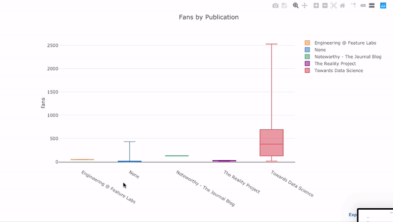
The benefits of interactivity are that we can explore and subset the data as we like. There’s a lot of information in a boxplot, and without the ability to see the numbers, we’ll miss most of it!
Scatterplots
The scatterplot is the heart of most analyses. It allows us to see the evolution of a variable over time or the relationship between two (or more) variables.
Time-Series
A considerable portion of real-world data has a time element. Luckily, plotly + cufflinks was designed with time-series visualizations in mind. Let’s make a dataframe of my TDS articles and look at how the trends have changed.
 Create a dataframe of Towards Data Science Articles
tds = df[df['publication'] == 'Towards Data Science'].\
         set_index('published_date')
# Plot read time as a time series
tds[['claps', 'fans', 'title']].iplot(
    y='claps', mode='lines+markers', secondary_y = 'fans',
    secondary_y_title='Fans', xTitle='Date', yTitle='Claps',
    text='title', title='Fans and Claps over Time')
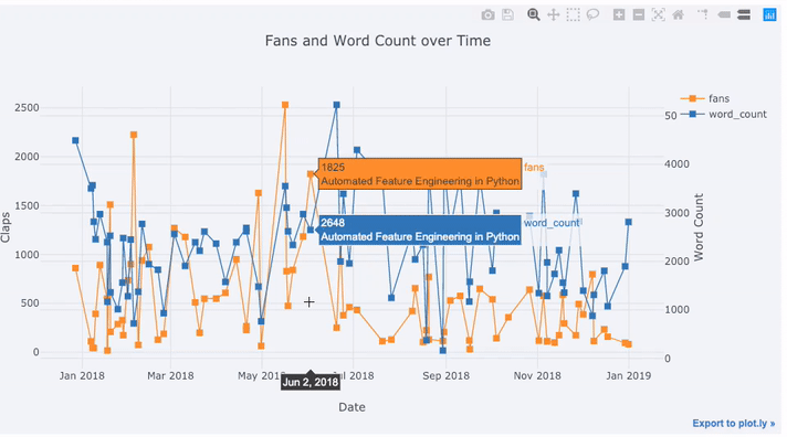
Here we are doing quite a few different things all in one line:
- Getting a nicely formatted time-series x-axis automatically
- Adding a secondary y-axis because our variables have different ranges
- Adding in the title of the articles as hover information
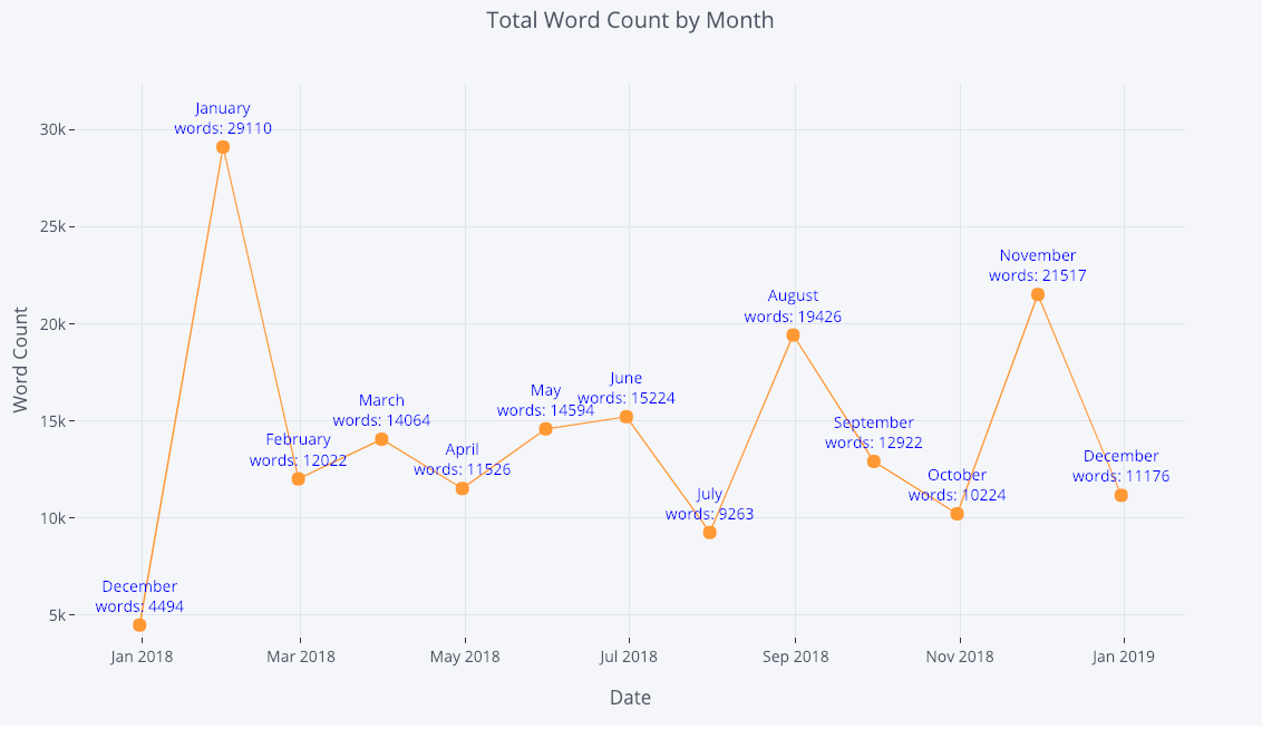
For more information, we can also add in text annotations quite easily:
tds_monthly_totals.iplot(
    mode='lines+markers+text',
    text=text,
    y='word_count',
    opacity=0.8,
    xTitle='Date',
    yTitle='Word Count',
    title='Total Word Count by Month')
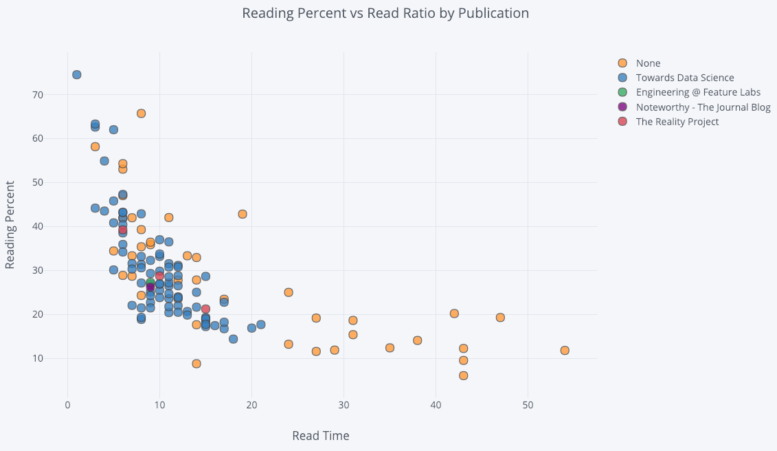
For a two-variable scatter plot colored by a third categorical variable we use:
df.iplot(
    x='read_time',
    y='read_ratio',
    # Specify the category
    categories='publication',
    xTitle='Read Time',
    yTitle='Reading Percent',
    title='Reading Percent vs Read Ratio by Publication')
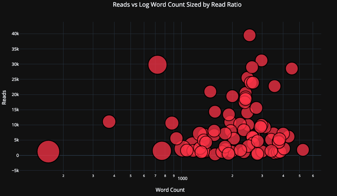
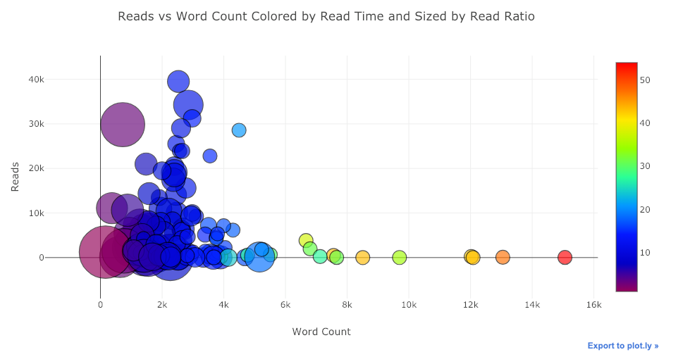
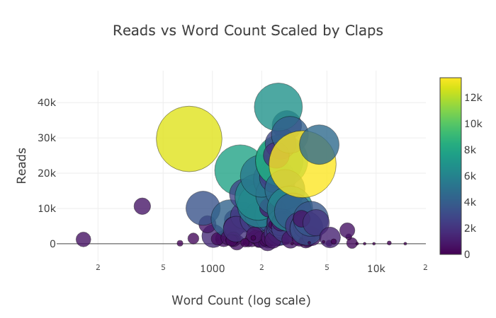
Let’s get a little more sophisticated by using a log axis — specified as a plotly layout — (see the Plotly documentation for the layout specifics) and sizing the bubbles by a numeric variable:
tds.iplot(
    x='word_count',
    y='reads',
    size='read_ratio',
    text=text,
    mode='markers',
    # Log xaxis
    layout=dict(
        xaxis=dict(type='log', title='Word Count'),
        yaxis=dict(title='Reads'),
        title='Reads vs Log Word Count Sized by Read Ratio'))
With a little more work (see notebook for details), we can even put four variables (this is not advised) on one graph!
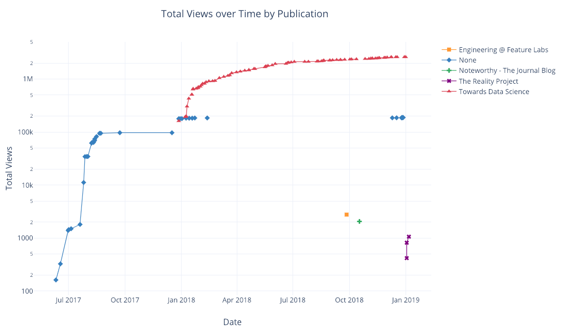
As before, we can combine pandas with plotly+cufflinks for useful plots
df.pivot_table(
    values='views', index='published_date',
    columns='publication').cumsum().iplot(
        mode='markers+lines',
        size=8,
        symbol=[1, 2, 3, 4, 5],
        layout=dict(
            xaxis=dict(title='Date'),
            yaxis=dict(type='log', title='Total Views'),
            title='Total Views over Time by Publication'))
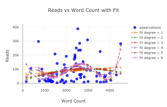
See the notebook or the documentation for more examples of added functionality. We can add in text annotations, reference lines, and best-fit lines to our plots with a single line of code, and still with all the interaction.
Advanced Plots
Now we’ll get into a few plots that you probably won’t use all that often, but which can be quite impressive. We’ll use the plotly [figure_factory](https://plot.ly/python/figure-factory-subplots/), to keep even these incredible plots to one line.
Scatter Matrix
When we want to explore relationships among many variables, a scattermatrix (also called a splom) is a great option:
import plotly.figure_factory as ff
figure = ff.create_scatterplotmatrix(
    df[['claps', 'publication', 'views',
        'read_ratio','word_count']],
    diag='histogram',
    index='publication')
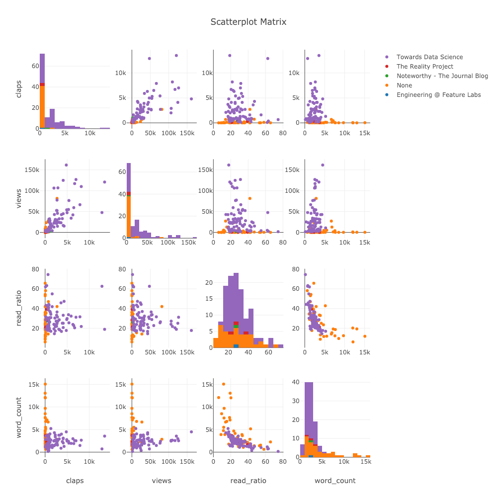
Even this plot is completely interactive allowing us to explore the data.
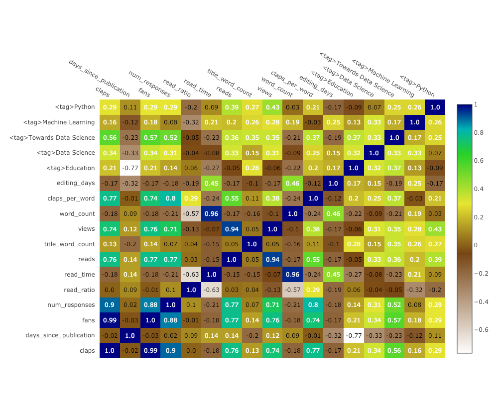
Correlation Heatmap
To visualize the correlations between numeric variables, we calculate the correlations and then make an annotated heatmap:
corrs = df.corr()
figure = ff.create_annotated_heatmap(
    z=corrs.values,
    x=list(corrs.columns),
    y=list(corrs.index),
    annotation_text=corrs.round(2).values,
    showscale=True)
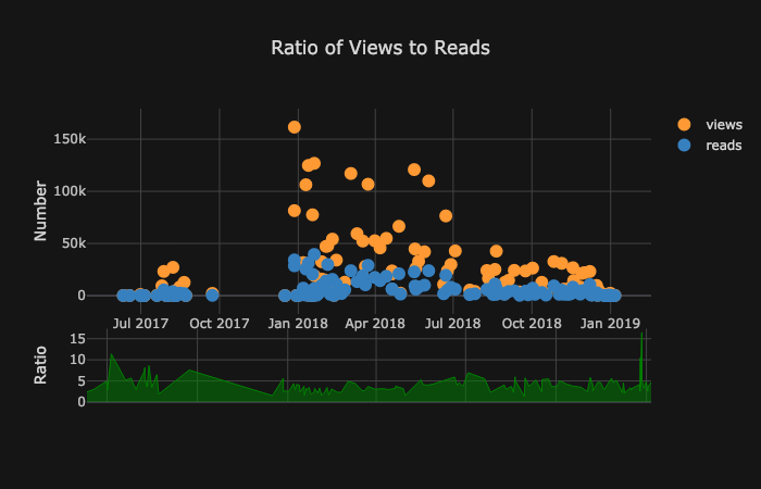
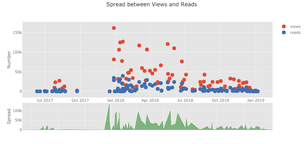
The list of plots goes on and on. Cufflinks also has several themes we can use to get completely different styling with no effort. For example, below we have a ratio plot in the “space” theme and a spread plot in “ggplot”:
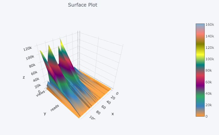
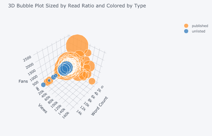
We also get 3D plots (surface and bubble):
For those who are so inclined, you can even make a pie chart:

Editing in Plotly Chart Studio
When you make these plots in the notebook, you’ll notice a small link on the lower right-hand side on the graph that says “Export to plot.ly”. If you click that link, you are then taken to the chart studio where you can touch up your plot for a final presentation. You can add annotations, specify the colors, and generally clean everything up for a great figure. Then, you can publish your figure online so anyone can find it with the link.
Below are two charts I touched up in Chart Studio:
With everything mentioned here, we are still not exploring the full capabilities of the library! I’d encourage you to check out both the plotly and the cufflinks documentation for more incredible graphics.
Conclusions
The worst part about the sunk cost fallacy is you only realize how much time you’ve wasted after you’ve quit the endeavor. Fortunately, now that I’ve made the mistake of sticking with matploblib for too long, you don’t have to!
When thinking about plotting libraries, there are a few things we want:
- One-line charts for rapid exploration
- Interactive elements for subsetting/investigating data
- Option to dig into details as needed
- Easy customization for final presentation
As of right now, the best option for doing all of these in Python is plotly. Plotly allows us to make visualizations quickly and helps us get better insight into our data through interactivity. Also, let’s admit it, plotting should be one of the most enjoyable parts of data science! With other libraries, plotting turned into a tedious task, but with plotly, there is again joy in making a great figure!
Now that it’s 2019, it is time to upgrade your Python plotting library for better efficiency, functionality, and aesthetics in your data science visualizations.
30s ad
☞ An introduction to Python Requests library - How HTTP requests work
☞ Python for NLP: Developing an Automatic Text Filler using N-Grams
☞ How to Plot Charts in Python with Matplotlib
☞ How to Use C Functions in Python
Suggest:
☞ Python Tutorials for Beginners - Learn Python Online
☞ Python Tutorial for Data Science
☞ Learn Python in 12 Hours | Python Tutorial For Beginners
☞ Complete Python Tutorial for Beginners (2019)
☞ Python Tutorial for Beginners [Full Course] 2019
☞ Python Programming Tutorial | Full Python Course for Beginners 2019