Evaluation of Python Grid Studio Using COVID-19 Data

Recently, I found an excellent open-source project “Grid Studio”. This library combines the advantages of the spreadsheet and Python in terms of data analytics.
Have you been thinking that
- When you use MS Excel, you want to use your Python skills and libraries such as Numpy, Pandas, SciPy, Matplotlib and Scikit-learn to generate and manipulate data
- When you use Python, you may think the tabular view of the data is needed to have a picture of the current dataset in real-time, but what you can do is only output
df.head()manually.
OK, this library can satisfy all your requirements.
Before everything, let’s have a look at how it looks like. Grid Studio is a Web-based application. Here is the Web UI.
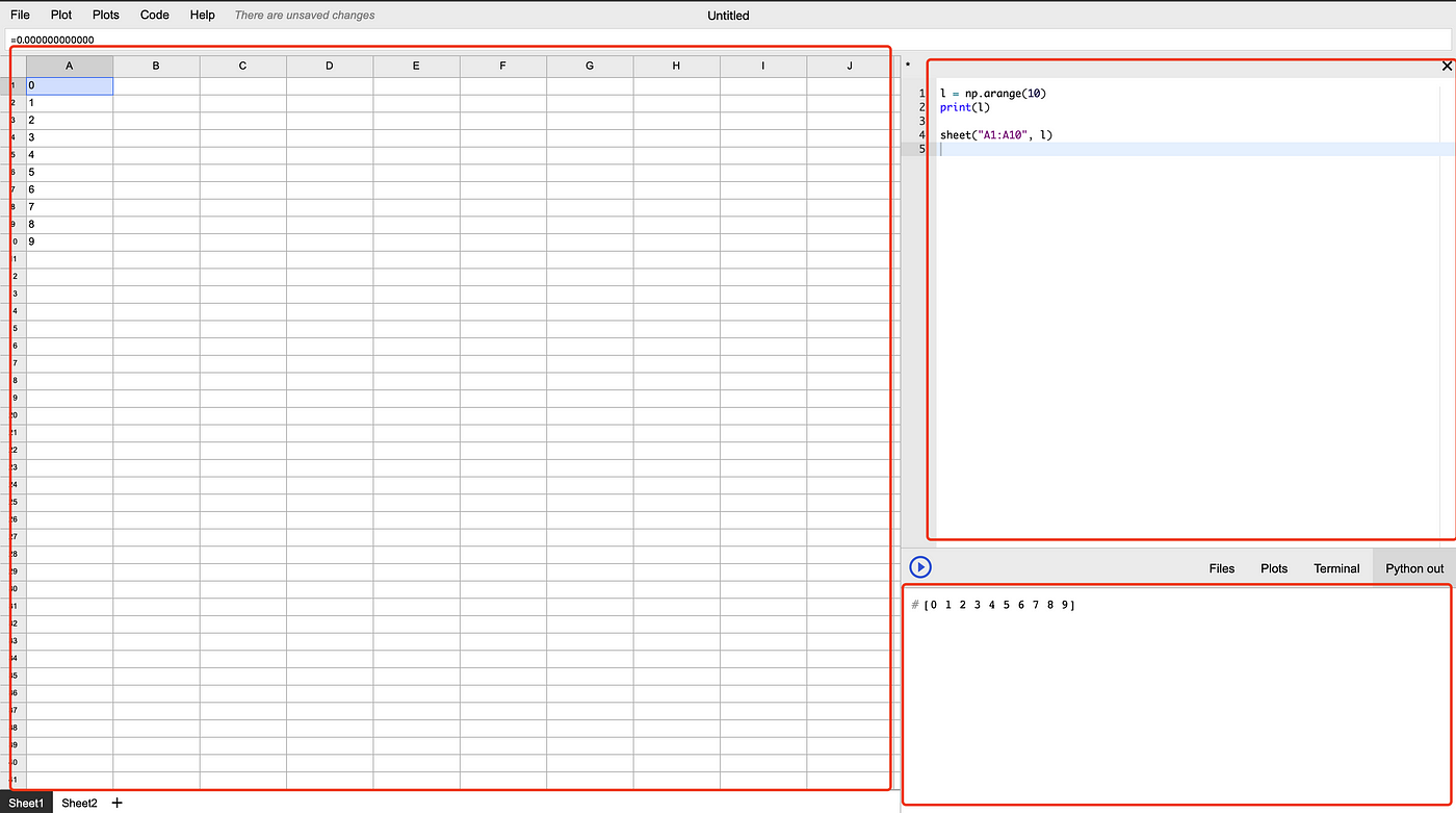
The UI is divided into 3 main panels.
- The spreadsheet, which is exactly same as popular software such as Excel and Google Sheets.
- Code area, which you can write your python code.
- File/Plots/Terminal/Stdout window, which aggregates these 4 windows as different tabs.
Therefore, with this library, you can use the code area to write your Python code and run it line-by-line just like Jupyter/iPython, and the “Python out” window will show the results. Also, you may synchronise your Pandas data frame to the spreadsheet to have an instant look.
Installation
Photo by Bret Kavanaugh on Unsplash
Let’s start from the installation of Grid Studio. You will need docker on your local machine to run the source code. If you don’t have docker desktop at the moment, you can download it from here:
Docker Desktop for Mac and Windows | Docker
https://www.docker.com/products/docker-desktop
After that, clone the repo at GitHub:
https://github.com/ricklamers/gridstudio
git clone https://github.com/ricklamers/gridstudio
Then, simply go to its root folder and run the starting script:
cd gridstudio && ./run.sh
It may take a couple of minutes to wait for docker to pull all the components. After that, you will be able to access the Web UI at
http://localhost:8080/
Sample Analytics Example of COVID-19 Data
I don’t like to write examples for the sake of examples. So, let’s use some real data to do some basic data analysis using Grid Studio.
We can get COVID-19 confirmed cases data here:
Download the data as a CSV file, which contains COVID-19 data for all countries in the world.
Load data into the spreadsheet
# Read all data
df = pd.read_csv("https://opendata.ecdc.europa.eu/covid19/casedistribution/csv").dropna()
print(df.head())
We can directly read online CSV files via the link. Here I think there is an improvement of Grid Studio. That is, it does not like Jupyter Notebook that can instantly print your variables. If you want to print your variables, you have to use theprint method.
Another limitation is that it looks like the spreadsheet does not support datetime type very well. During the testing, I found that it cannot display pandas column with datetime64[ns] type. So, I would like to convert the dateRep column into integers.
# Convert date to integer (because of Grid Studio limitation)
df.dateRep = pd.to_datetime(df.dateRep, format='%d/%m/%Y').dt.strftime('%Y%m%d').astype(int)
Transform data
Firstly, let’s filter the data by country. For example, I’m interested in Australia data only.
# Get Australia data
df_oz = df[df.countriesAndTerritories == 'Australia']
Then, we will select only the dateRep, cases and deaths columns.
# Retain only date, cases and deaths columns
df_oz = df_oz[['dateRep', 'cases', 'deaths']]
After that, sort the data frame by the date so that we can calculate the cumulative cases and deaths.
# Calculate cumulative cases & deaths
df_oz = df_oz.sort_values('dateRep')
df_oz['cumCases'] = df_oz.cases.cumsum()
df_oz['cumDeaths'] = df_oz.deaths.cumsum()
Render the data into the spreadsheet
Now, we should have 5 columns in our Pandas data frame, which are date, new cases, new deaths, cumulative cases and cumulative deaths. Let’s render the data frame into the spreadsheet.
# Show in sheet
sheet("A1", df_oz)
Grid Studio makes it very easy to do this. By calling its API sheet, we simply specify the top-left cell that the data frame will be rendered, and then pass on the data frame variable.
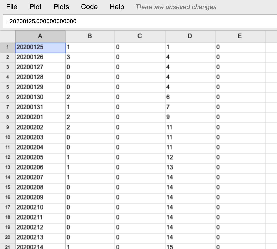
If you would like to show the headers, you can also specify header=True in the sheet method.
More features in the spreadsheet
When the data is in the spreadsheet, we can use it just like the other regular software such as Excel and Google Sheets. I won’t demonstrate the formula features such as SUM, AVG and etc. that everyone would be familiar.
One of the most useful features is that you can easily export the spreadsheet into CSV. That means we can use the power of Pandas data frame to easily download and transform the data, then export to use other software to do further analytics.

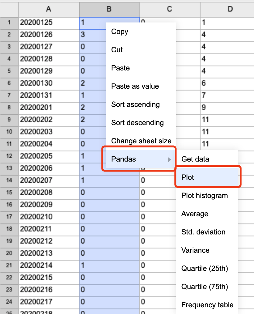
Another one I believe that is quite useful is plotting the data using matplotlib by clicks. For example, if we want to plot the daily new cases, just simply select the “new cases” column and right-click on it as shown in the screenshot below.
Then, on the bottom right corner, you can find the plot in the “Plots” tab.
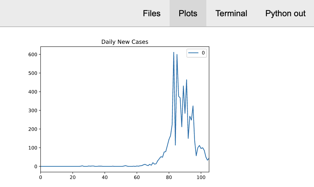
In fact, Grid studio has done this plot by auto-generating code. Here is the code that is generated for the above chart.
data = sheet("B1:B106")
data.plot()
show()
So, we can add some annotations if necessary. For example, we can add a title to this chart:
data = sheet("B1:B106")
data.plot(title='Daily New Cases')
show()
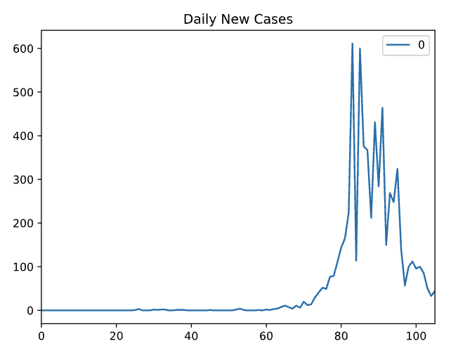
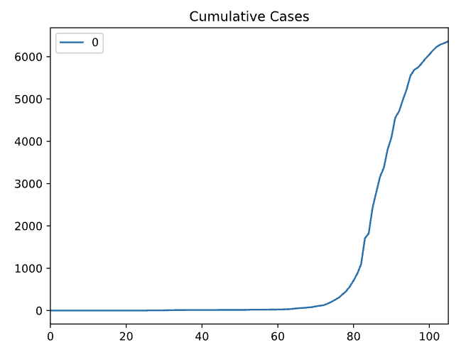
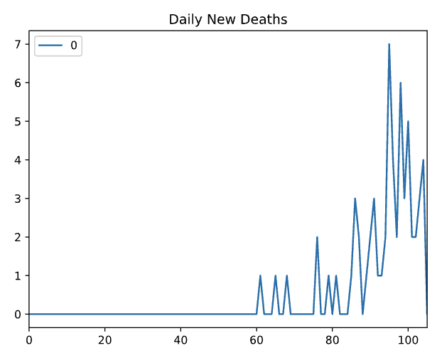
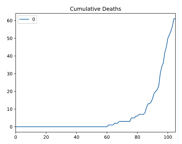
Similarly, we can plot the 4 columns separately using the same procedures. The following 3 more charts were generated by simple clicks and adding titles which took me 30 seconds in total!
It is clear that using Grid Studio to perform some simple data analysis would be very quick and convenient. Thanks to Rick Lamers who is the author for his amazing idea.
Limitations and Future Improvement
While I really like the idea of this application that combines spreadsheet and Python, I have to say that it is still far away from mature. At least some limitations and potential improvements need to be resolved and implemented in my opinion:
- Should support all the Pandas data types
- Should implement more features of spreadsheets that most similar application would have such as dragging to fill
- There are some bugs in the spreadsheet need to be fixed, for example, the loaded data seems stuck in the memory that might not be able to be deleted from the spreadsheet.
- Suggestion: it would be great if we can bind the sheet with a Pandas data frame. That is, when you modify the sheet, the data frame updated, and vice versa.
- Suggestion: it would be great if the Python stdout output can be converted to iPython style with
[1]:line number, which will make debugging much easier.
Suggest:
☞ Python Tutorials for Beginners - Learn Python Online
☞ Learn Python in 12 Hours | Python Tutorial For Beginners
☞ Complete Python Tutorial for Beginners (2019)
☞ Python Programming Tutorial | Full Python Course for Beginners 2019