How to Create Animated Graphs in Python

How nice would it be if in you next presentation, video or social media post you can present development in the data by using a short video clip? And even better, you can still keep using Matplotlib, Seaborn or any other library that you like to use for your plots!
I’ve recently made a couple of dynamic plots for a short documentary about the opioid crisis in the USA so I will be using the data from that in this post. The data is made publicly available by the National Institute on Drug Abuse and the CDC and can be downloaded here: https://www.drugabuse.gov/sites/default/files/overdose_data_1999-2015.xls.
In this post I will be using Matplotlib with the addition of Seaborn for plotting and Numpy together with Pandas for data handling. For the animation matplotlib offers some functions that we can use. So lets go ahead and import all dependencies.
import numpy as np
import pandas as pd
import seaborn as sns
import matplotlib
import matplotlib.pyplot as plt
import matplotlib.animation as animation
Now to get ready for animating the data we only need to load it and put it into a Pandas DataFrame. When making several plots concerning overdoses on different opioids it can be convenient to also write a function for loading the data from the row you are interested in.
overdoses = pd.read_excel('overdose_data_1999-2015.xls',sheetname='Online',skiprows =6)
def get_data(table,rownum,title):
    data = pd.DataFrame(table.loc[rownum][2:]).astype(float)
    data.columns = {title}
    return data
So now lets start and get to the animation!
First of all, if you are using jupyter notebooks like I am it is good to start this cell of with a %matplotlib notebook so you can see the animation right away in your notebook and not just after it has been saved.
In my case I now retrieve the heroin overdose numbers from the table using the get_data function and pack it into a Pandas DataFrame with two columns. One for the year and the other for the count of overdoses.
%matplotlib notebook
title = 'Heroin Overdoses'
d = get_data(overdoses,18,title)
x = np.array(d.index)
y = np.array(d['Heroin Overdoses'])
overdose = pd.DataFrame(y,x)
#XN,YN = augment(x,y,10)
#augmented = pd.DataFrame(YN,XN)
overdose.columns = {title}
Next we initialize a writer which uses ffmpeg and records at 20 fps with a bitrate of 1800. You can of course pick these values yourself.
Writer = animation.writers['ffmpeg']
writer = Writer(fps=20, metadata=dict(artist='Me'), bitrate=1800)
Now lets create a figure with some labels. Make sure to set the limits for the x and y axis so your animation doesn’t jump around with the range of the data currently displayed.
fig = plt.figure(figsize=(10,6))
plt.xlim(1999, 2016)
plt.ylim(np.min(overdose)[0], np.max(overdose)[0])
plt.xlabel('Year',fontsize=20)
plt.ylabel(title,fontsize=20)
plt.title('Heroin Overdoses per Year',fontsize=20)
The heart piece of your animation is your animation function in which you define what happens in each frame of your video. Here i represents the index of the frame in the animation. With this index you can select the data range which should be visible in this frame. After doing that I use a seaborn lineplot to plot this data selection. The last two lines are just to make the plot look a bit more pleasing.
def animate(i):
    data = overdose.iloc[:int(i+1)] #select data range
    p = sns.lineplot(x=data.index, y=data[title], data=data, color="r")
    p.tick_params(labelsize=17)
    plt.setp(p.lines,linewidth=7)
To start the animation use matplotlib.animation.FuncAnimation in which you link the animation function and define how many frames your animation should contain. frames therefore defines how often animate(i) is being called.
ani = matplotlib.animation.FuncAnimation(fig, animate, frames=17, repeat=True)
To save this animation as an mp4 you can simply call ani.save() . If you just want to take a look at it before you save it call plt.show() instead.
ani.save('HeroinOverdosesJumpy.mp4', writer=writer)
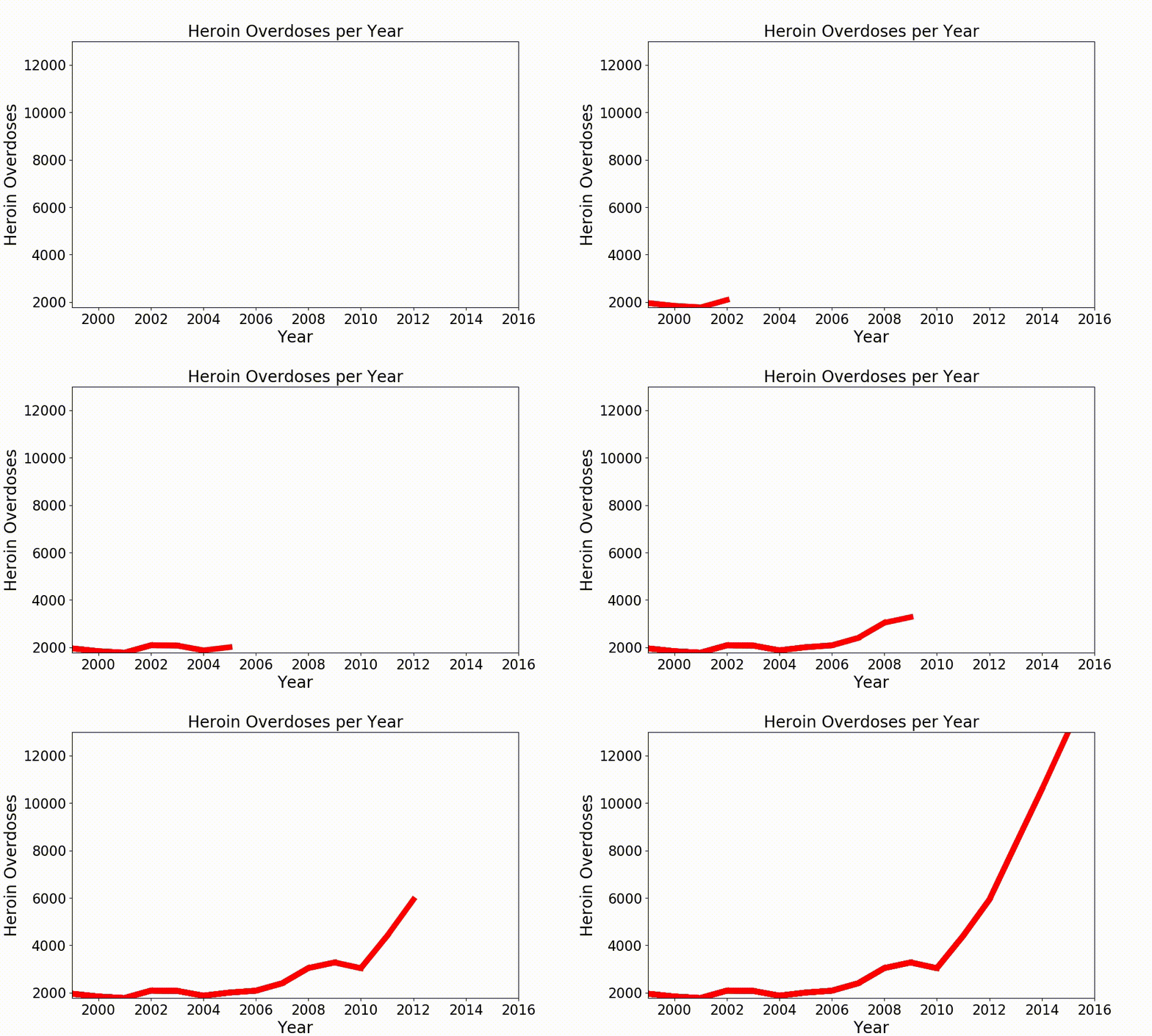
So now the animation looks like this:

It kind of works but it is still very jumpy. To avoid the jumpiness of it we need some more data points in between the ones we already have. For this we can use another function which I call here augment .
def augment(xold,yold,numsteps):
    xnew = []
    ynew = []
    for i in range(len(xold)-1):
        difX = xold[i+1]-xold[i]
        stepsX = difX/numsteps
        difY = yold[i+1]-yold[i]
        stepsY = difY/numsteps
        for s in range(numsteps):
            xnew = np.append(xnew,xold[i]+s*stepsX)
            ynew = np.append(ynew,yold[i]+s*stepsY)
    return xnew,ynew
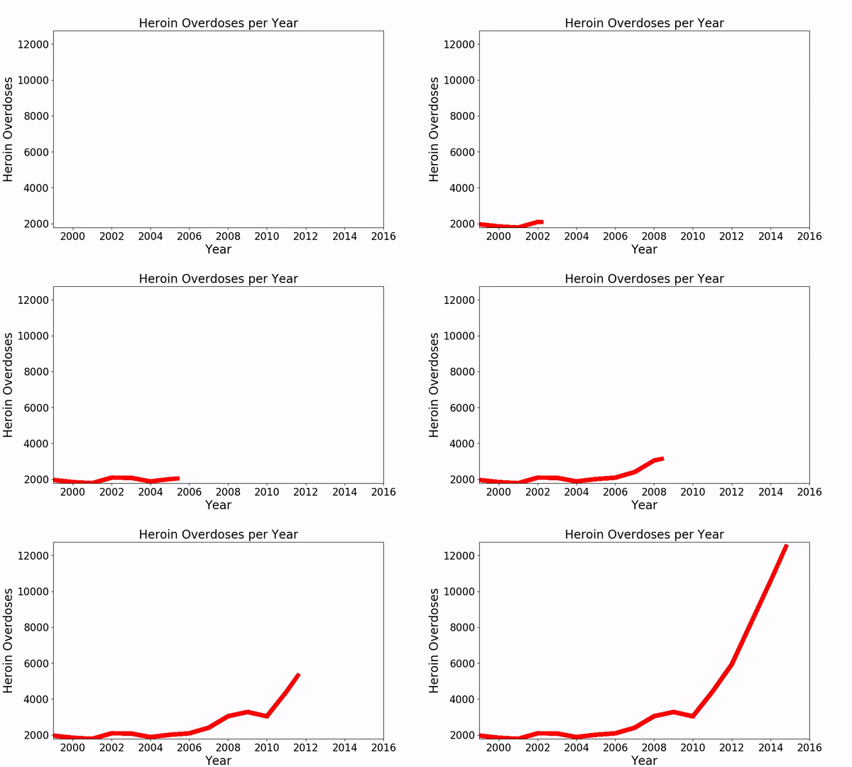
Now we just need to apply this function to our data and increase the number of frames in the matplotlib.animation.FuncAnimation function. Here I call augment with numsteps=10which means that I increase my training data to 160 datapoints and have to set frames=160 . The result looks much more smooth but there are still some sharp edges where the data values change.

To get rid of these we can implement a smoothing function as described here: https://www.swharden.com/wp/2008-11-17-linear-data-smoothing-in-python/
def smoothListGaussian(listin,strippedXs=False,degree=5):
    window=degree*2-1
    weight=np.array([1.0]*window)
    weightGauss=[]
    for i in range(window):
        i=i-degree+1
        frac=i/float(window)
        gauss=1/(np.exp((4*(frac))**2))
        weightGauss.append(gauss)
    weight=np.array(weightGauss)*weight
    smoothed=[0.0]*(len(listin)-window)
    for i in range(len(smoothed)):        smoothed[i]=sum(np.array(listin[i:i+window])*weight)/sum(weight)
    return smoothed
Additionally we can add some color and style parameter to make the plot look more individual.
sns.set(rc={'axes.facecolor':'lightgrey', 'figure.facecolor':'lightgrey','figure.edgecolor':'black','axes.grid':False})
This is how we obtain the final result shown above.
This post just shows the matplotlib animation function on one example. Of course you can use it for any kind of plot you want to animate. Simple adjust the parameters and plot type inside your animate() function and the possibilities are endless.
I hope you’ll enjoy this nice functionality of matplotlib and can put it to some great use! If you want to check out the full documentary with all graphics I’ve made for it and get inspired you can find it here: https://youtu.be/7xrvuSDLHiY
☞ Django Core | A Reference Guide to Core Django Concepts
☞ Python Programming for Beginners
☞ Python Programming For Network Engineers
Suggest:
☞ Python Tutorial for Data Science
☞ Learn Python in 12 Hours | Python Tutorial For Beginners
☞ Complete Python Tutorial for Beginners (2019)
☞ Python Tutorials for Beginners - Learn Python Online
☞ Python Programming Tutorial | Full Python Course for Beginners 2019