Learn How To Build A Data-Driven Search UI with Vue.JS

Crafting good-looking search UIs is hard and often times can be a frustrating development endeavor. In this post, I will walk you through building a data-driven search UI — we will use a dataset for Github’s top repositories and build a search UI to explore this data using Vue.JS and ElasticSearch. Don’t worry if you aren’t familiar with either of the technologies — we will go over the basics and show you how to build an awesome search UI that’s mobile responsive, can search as you type, handle typos, and uses various other filters as well. And you will be able to follow along and build what you are seeing in this live demo in just under an hour!
Before diving in, you can try out the Live demo of the final app.
At appbase.io, we built ReactiveSearch — A React / React Native / Vue.JS components library to provide the building blocks for crafting delightful search experiences. ReactiveSearch marries ElasticSearch’s expressive search queries with Vue.js’s composable UI components.
Getting Started
First things first, let’s get started with the app. We will use Code Sandbox for building the app.
We will be using appbase.io for our hosted ElasticSearch backend as it has a generous free tier. This saves us time and cost of both setting up and maintaining our own search engine backend. An added benefit is that ReactiveSearch components can be secured when using a service like appbase.io — saving us some more work in otherwise writing a middleware server.
We —-create–> ReactiveSearch UI components –that speak with–> appbase.io –which offers–> hosted search backend.
Here is the sandbox of our starting application. You can open the settings and see that we are including ReactiveSearch styles files. In the JavaScript view, we have added React, ReactDOM, and ReactiveSearch libraries. We will also use FontAwesome for the UI icons.
Our search UI can only be as good as the underlying dataset. We have used Github’s REST API to create a demo dataset of the top 25K+ repositories (all repositories with ≥ 500 Github stars). You can view the live dataset that’s already indexed in an appbase.io app below.
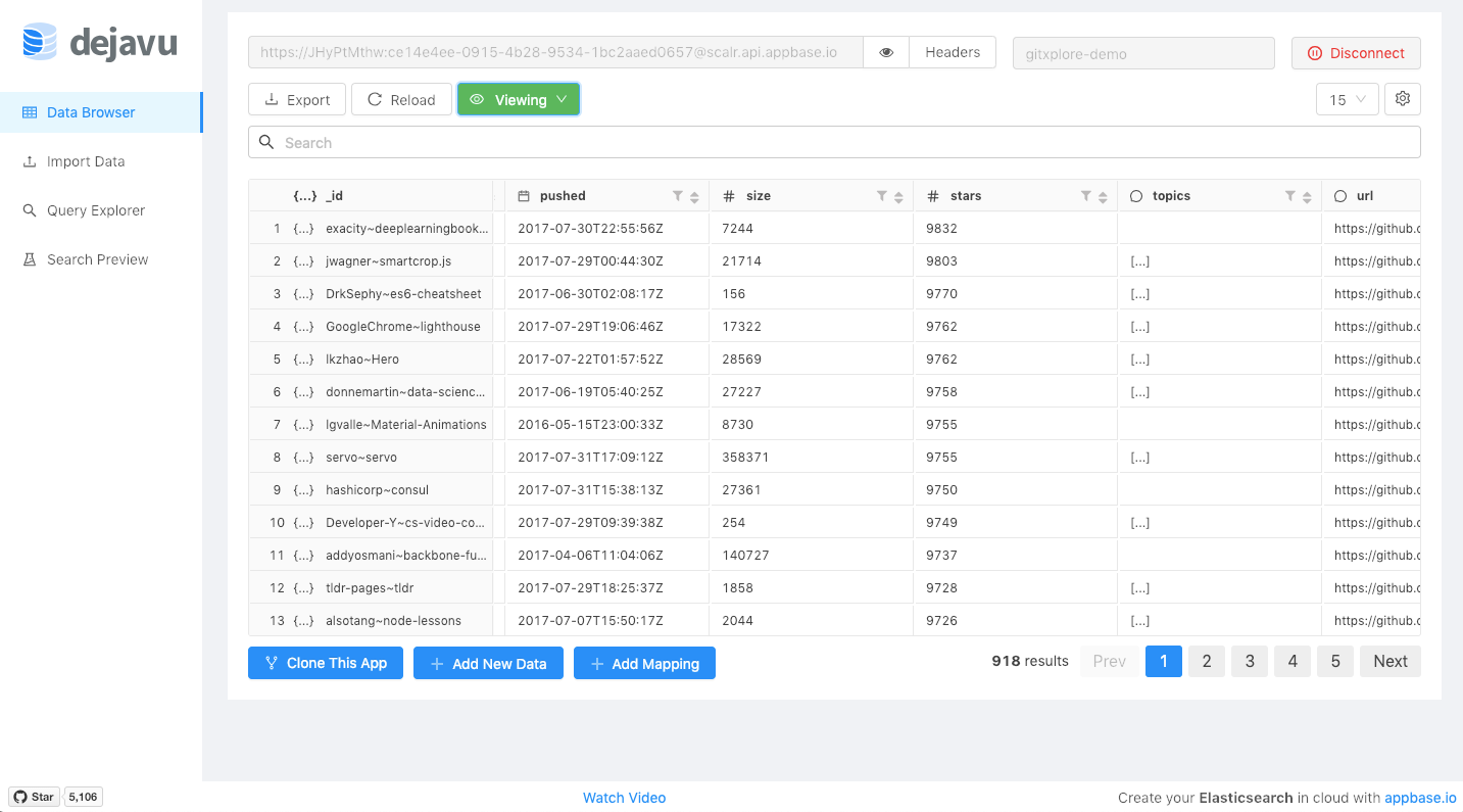
You can click on the Clone this app button as shown in the above image to import the dataset directly from the dejavu GUI. This also helps us skip past the indexing part, as a search engine requires all the searchable data to be indexed as analyzed data (so it can find typos, search on partial words, etc). Dejavu’s clone feature takes care of this for us by using the source app’s analyzer and mapping settings.
For each repository, we are storing its name, description, language, topics, owner info, star, fork and watch count, date of creation and when the repo was last pushed. For reference, an individual record looks like this:
{
    "name": "freeCodeCamp",
    "owner": "freeCodeCamp",
    "fullname": "freeCodeCamp~freeCodeCamp",
    "description": "The https://freeCodeCamp.com open source codebase and curriculum. Learn to code and help nonprofits.",
    "avatar": "https://avatars3.githubusercontent.com/u/9892522?v=3",
    "url": "https://github.com/freeCodeCamp/freeCodeCamp",
    "pushed": "2017-07-30T19:27:08Z",
    "created": "2014-12-24T17:49:19Z",
    "size": 30916,
    "stars": 290987,
    "forks": 12465,
    "topics": ["careers", "education", "javascript"],
    "language": "JavaScript",
    "watchers": 8555
}
data.json
Breaking down the UI
At this point, we have the Github repos dataset imported into our appbase.io app. We will now break down the search user interface into its constituent components and then use ReactiveSearch to build each of them.
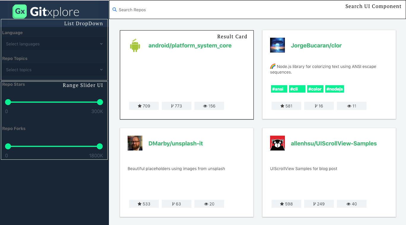
We can see that the UI is composed of four main constituents:
- A Search UI over repositories and their descriptions
- A List Dropdown (used for Language, Topics, Last Active and Created info)
- A Range Slider UI for filtering by stars and forks count
- A Result Card to display the results.
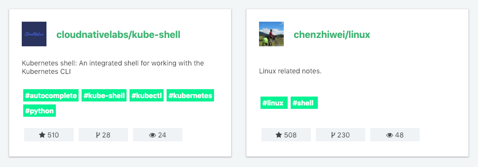
ReactiveList creates a data-driven result list UI component.
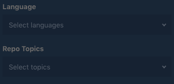
Language and Topics are shown using the MultiDropdownList component.
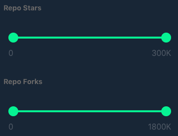
For showing repo stars and repo forks info (both are integer values), we use the RangeSlider component.
Deep Dive with Code
Now that we have the basic design in mind and know which components, we can deep dive into writing the actual code.
ReactiveBase
First Component that we will make use of is [ReactiveBase](https://opensource.appbase.io/reactive-manual/vue/getting-started/reactivebase.html).
ReactiveBase is a container component that wraps all the ReactiveSearch components together. It binds the backend app (data source) with the UI view components (elements wrapped within ReactiveBase), allowing a UI component to be reactively updated every time there is a change in the data source or in other UI components.
To read more about it feel free to explore the docs. Here is the snippet of code reflecting the properties that are passed to ReactiveBase component.
<template>
  <section class="container">
    <ReactiveBase
      app="gitxplore-app"
      credentials="4oaS4Srzi:f6966181-1eb4-443c-8e0e-b7f38e7bc316"
      type="gitxplore-latest"
    >
    </ReactiveBase>
  </section>
</template>
reactiveBase.vue
gist showing usage of ReactiveBase.
Now let’s talk about props passed to the component, these are some of the props passed by us but there are other’s well if you want to know feel free to explore the docs.
- app
String
app name as it appears on the dashboard. Refers to an index if you’re using your own Elasticsearch cluster. (Multiple indexes can be connected to by specifying comma separated index names) - type
String[optional]
types on which the queries should run on. Multiple types can be passed as comma separated values. The default behavior here is to search on all the app types. - credentials
String[optional]
app credentials as they appear on the dashboard. It should be a string of the format “username:password” and is used for authenticating the app. If you are not using an appbase.io app, credentials may not be necessary - although having an open-access Elasticsearch cluster is not recommended.
The app and credentials are specific for your app which you can get from the app’s credentials page. You can also pass a theme prop which will set the theme for all the child components. Read more about theming here.
Updated Sandbox
DataSearch
Second Component that we will make use of is [DataSearch](https://opensource.appbase.io/reactive-manual/vue/search-components/datasearch.html), it creates a search box UI component that is connected to one or more database fields.

We’ll be using DataSearch component to search through repositories categorized on the basis of languages. DataSearch component creates a category search UI widget with an autosuggest functionality. It lets us search across one or more fields easily. Read more about it in the docs.
<DataSearch
    componentId="repo"
    filterLabel="Search"
    :dataField="[
      'name',
      'description',
      'name.raw',
      'fullname',
      'owner',
      'topics'
    ]"
    placeholder="Search Repos"
    iconPosition="left"
    :autosuggest="true"
    URLParams
    class="data-search-container results-container"
    :innerClass="{
      input: 'search-input'
    }"
/>
datasearch.vue
Now let’s talk about props passed to the component, these are some of the props passed by us but there are other’s well if you want to know feel free to explore the docs.
- componentId
String
unique identifier of the component, can be referenced in other components’reactprop. - dataField
String or Array
database field(s) to be connected to the component’s UI view. DataSearch accepts an Array in addition to String, useful for applying search across multiple fields. - placeholder
String[optional]
set the placeholder text to be shown in the searchbox input field. Defaults to “Search”. - iconPosition
String[optional] sets the position of the search icon. Can beleftorright. Defaults toright.
Please find sandbox with all the changes made.
Updated Sandbox
MultiDropdownList
Third Component that we will make use of is [MultiDropDownList](https://opensource.appbase.io/reactive-manual/vue/list-components/multidropdownlist.html).
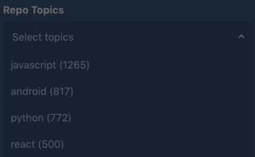
MultiDropdownList is perfect to filter the results based on our repository language. It creates a multiple select dropdown based list UI widget. You can find more about it in the docs.
<MultiDropdownList
  componentId="language"
  dataField="language.raw"
  placeholder="Select languages"
  title="Language"
  filterLabel="Language"
  :innerClass="{
    select: 'dropdown-select',
    title: 'inner-title',
    list: 'dropdown-list'
  }"
/>
multidropdown.vue
Now, some of the properties like dataField, componentId, are similar to that of the previous component, but we have some new properties that we haven’t see before for instance placeholder, filterLabel, title let me define them.
Now let’s talk about props passed to the component, these are some of the props passed by us but there are other’s well if you want to know feel free to explore the docs.
- placeholder
String[optional]
set the placeholder text to be shown in the searchbox input field. Defaults to “Search”. - filterLabel
String[optional]
An optional label to display for the component in the global selected filters view. This is only applicable ifshowFilteris enabled. Default value used here iscomponentId. - title
String or JSX[optional]
title of the component to be shown in the UI.
Please find sandbox with all the changes made.
Updated Sandbox
RangeSlider
Fourth Component that we will make use of is RangeSlider.

We’ll be using RangeSlider components to search the repositories on the basis of the number of stars and forks, defining a starting and ending limit. It creates a numeric range slider UI component, very useful for granular filtering of numeric data. Find out more about it in the docs.(docs for vue not added yet, will update the link once they are added.)
<RangeSlider
  dataField="stars"
  componentId="stars"
  title="Repo Stars"
  :range="{
    start: 0,
    end: 300000
  }"
  :defaultSelected="{
    start: 0,
    end: 300000
  }"
  :innerClass="{
    title: 'inner-title',
    slider: 'inner-slider-ui'
  }"
  :rangeLabels="{
    start: '0',
    end: '300K'
  }"
/>
rangeSlider.vue
Now let’s talk about props passed to the component, these are some of the props passed by us but there are other’s well if you want to know feel free to explore the docs.
- range
Objectan object withstartandendkeys and corresponding numeric values denoting the minimum and maximum possible slider values. - defaultSelected
Object[optional]
an object withstartandendkeys and corresponding numeric values denoting the pre-selected range values.
Please find sandbox with all the changes made.
Updated Sandbox
ReactiveList
Fifth Component that we will make use of is [ReactiveList](https://opensource.appbase.io/reactive-manual/vue/getting-started/componentsindex.html), Up until now we’ve been creating search components, to filter out the repositories. Now we’ll need a component to display the results according to the selected filters.
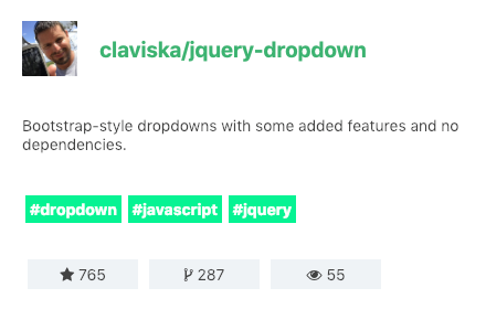
ReactiveList creates a data-driven result list UI component. This list can reactively update itself based on changes in other components or changes in the database itself.
<ReactiveList
  componentId="results"
  dataField="name.raw"
  :pagination="true"
  :from="0"
  :size="6"
  :innerClass="{
    list: 'result-list-container',
    pagination: 'result-list-pagination',
    resultsInfo: 'result-list-info',
    poweredBy: 'powered-by'
  }"
  :react="{
    and: ['language', 'topics', 'repo', 'stars', 'forks']
  }"
  :sortOptions="[
    {
      label: 'Best Match',
      dataField: '_score',
      sortBy: 'desc'
    },
    {
      label: 'Most Stars',
      dataField: 'stars',
      sortBy: 'desc'
    },
    {
      label: 'Fewest Stars',
      dataField: 'stars',
      sortBy: 'asc'
    },
    {
      label: 'Most Forks',
      dataField: 'forks',
      sortBy: 'desc'
    },
    {
      label: 'Fewest Forks',
      dataField: 'forks',
      sortBy: 'asc'
    },
    {
      label: 'A to Z',
      dataField: 'owner.raw',
      sortBy: 'asc'
    },
    {
      label: 'Z to A',
      dataField: 'owner.raw',
      sortBy: 'desc'
    },
    {
      label: 'Recently Updated',
      dataField: 'pushed',
      sortBy: 'desc'
    },
    {
      label: 'Least Recently Updated',
      dataField: 'pushed',
      sortBy: 'asc'
    }
  ]"
>
reactiveList.vue
Now let’s talk about props passed to the component, these are some of the props passed by us but there are other’s well if you want to know feel free to explore the docs.
- pagination
Boolean[optional]
pagination <> infinite scroll switcher. Defaults tofalse, i.e. an infinite scroll based view. When set totrue, a pagination based list view with page numbers will appear. - innerClass
Object[optional]
ReactiveSearch components also allowclassinjections to overwrite the default styles for any component at a more granular level. This can be achieved with theinnerClassprop. - react
Object[optional]
a dependency object defining how this component should react based on the state changes in the sensor components.
This accepts an object with the key and, or, not and an array as value with the componentId of all components that it should reactively update to. Here we want the results to update based on the updates to all our search components that we used before.
- sortOptions
Object Array[optional]
an alternative to thesortByprop,sortOptionscreates a sorting view in the ReactiveList component’s UI. Each array element is an object that takes three keys:
label - label to be displayed in the UI.
dataField - data field to use for applying the sorting criteria on.
sortBy - specified as either asc or desc.
Notice slot and slot-scope it is used to get data from the child component to parent component. If you have used React it is like a render-prop . You can read more about it here.
- onData
Function|scoped-slot[optional]
returns a list element object to be rendered based on theresdata object. This callback function prop or slot is called for each data item rendered in the ReactiveList component’s view.
  <div slot="onData" slot-scope="{ item }">
    <div key="{{item.name}}" class="result-item">
      <div
        class="flex justify-center align-center result-card-header"
      >
        <img class="avatar" :src="item.avatar" alt="User avatar" />
        <a
          class="link"
          href="{item.url}"
          target="_blank"
          rel="noopener noreferrer"
        >
          <div class="flex wrap">
            <div>{{ item.owner }}/</div>
            <div>{{ item.name }}</div>
          </div>
        </a>
      </div>
      <div class="m10-0">{{ item.description }}</div>
      <div class="flex wrap justify-center">
        <div
          v-for="(tag, index) in item.topics.slice(0, 7)"
          :key="index"
          class="topic"
          v-bind:class="[
            currentTopics.includes(item) ? 'active' : '',
            'topic'
          ]"
          @Click="toggleTopic(item);"
        >
          {{ tag }}
        </div>
      </div>
      <div class="flex">
        <div>
          <div class="btn card-btn">
            <i class="fa fa-star" aria-hidden="true"></i>
            {{ item.stars }}
          </div>
        </div>
        <div>
          <div class="btn card-btn">
            <i class="fa fa-code-fork" aria-hidden="true"></i>
            {{ item.forks }}
          </div>
        </div>
        <div>
          <div class="btn card-btn">
            <i class="fa fa-star" aria-hidden="true"></i>
            {{ item.watchers }}
          </div>
        </div>
      </div>
    </div>
  </div>
onDataSlot.vue
Please find sandbox with all the changes made.
Updated Sandbox
Conclusion
After taking into account CSS styling, we walked through building a complete UI that mimics how we can leverage search service powered by ReactiveSearch that lets users search for different repositories in GitHub and classify them with features encompassing stars, forks preferences such as languages, topics etc.
This post introduces ReactiveSearch-Vue — A Vue.js UI components library for ElasticSearch that provides scaffolding for building great search experiences. You can read more about it below.
Suggest:
☞ Vue js Tutorial Zero to Hero || Brief Overview about Vue.js || Learn VueJS 2023 || JS Framework
☞ Is Vue.js 3.0 Breaking Vue? Vue 3.0 Preview!
☞ Learn Vue.js from scratch 2018
☞ Vue.js Tutorial: Zero to Sixty