Star Rating Custom Component using Pure VueJS
Awesome Vue Star Rating Simple and Easy Customisable Awesome Vue Star Rating using Pure Vue application without any external package.
Awesome Vue Star Rating
Simple and Easy Customisable Awesome Vue Star Rating using Pure Vue application without any external package.
Installing
npm install --save awesome-vue-star-rating
Features
- Font icon stars — scale without loss of quality
- Customisable ratings and rating descriptions
- Customisable results of selected value and description
- Customisable number of stars
- Create read-only stars
- Customisable Colors
Options
| Property | Type | Required | Description |
|---|---|---|---|
| star | Number | Required. | Default value of Star. Default value is 2 |
| maxstars | Number | Required. | Default value is 5. |
| hasresults | Boolean | Optional. | Displaying the result values. Default value is true. |
| hasdescription | Boolean | Optional. | Default value is true. |
| ratingdescription | Array | Required. | Displaying the rating values. Ex. [{ text: 'Poor', class: 'star-poor' }, { text: 'Below Average', class: 'star-belowAverage' }, { text: 'Average', class: 'star-average' }, { text: 'Good', class: 'star-good' }, { text: 'Excellent', class: 'star-excellent' }] |
| starsize | String | Optional. | Displaying the size of the stars. Default value is lg. We have list of [xs,lg,1x,2x,3x,4x,5x,6x,7x,8x,9x,10x] other optional values too. |
| disabled | Boolean | Optional. | Enable or disable the star selection. Default value is false. |
Usage
Step 1: import AwesomeVueStarRating in our component
import AwesomeVueStarRating from 'awesome-vue-star-rating'

export default {
  name: 'app',
  components: {
    AwesomeVueStarRating
  }
}
</script>
Step 2: Load default values to the component
data() {
    return {
      star: 5, // default star
      ratingdescription: [
        {
          text: 'Poor',
          class: 'star-poor'
        },
        {
          text: 'Below Average',
          class: 'star-belowAverage'
        },
        {
          text: 'Average',
          class: 'star-average'
        },
        {
          text: 'Good',
          class: 'star-good'
        },
        {
          text: 'Excellent',
          class: 'star-excellent'
        }
      ],
      hasresults: true,
      hasdescription: true,
      starsize: 'lg', //[xs,lg,1x,2x,3x,4x,5x,6x,7x,8x,9x,10x],
      maxstars: 5,
      disabled: false
    }
}
Step 3: Place the Rate component inside the template
<template>
  <div id="app">
    <AwesomeVueStarRating :star="this.star" :disabled="this.disabled" :maxstars="this.maxstars" :starsize="this.starsize" :hasresults="this.hasresults" :hasdescription="this.hasdescription" :ratingdescription="this.ratingdescription" />
  </div>
</template>
Step 4: Customize the star color styles like below
<style lang="scss">
 .star {
  color: red;
 }
 .star.active {
  color: red;
 }
 .list, .list.disabled {
  &:hover {
    .star {
      color: red !important;
    }
    .star.active {
      color: red;
    }
  }
}
</style>
Compiles and hot-reloads for development
npm run serve
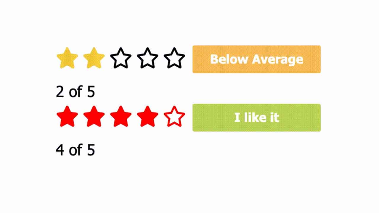
Screen Shot


Demo

🎉 Demo Link 🎉
Compiles and minifies for production
npm run build
Run your tests
npm run test
Download Details:
Author: Jebasuthan
Demo: https://codesandbox.io/s/reverent-heyrovsky-juycp
Source Code: https://github.com/Jebasuthan/vue-star-rating
Suggest:
☞ Vue js Tutorial Zero to Hero || Brief Overview about Vue.js || Learn VueJS 2023 || JS Framework
☞ Is Vue.js 3.0 Breaking Vue? Vue 3.0 Preview!
☞ Learn Vue.js from scratch 2018
☞ Vue.js Tutorial: Zero to Sixty